design criteria, mediatecture, exhibition design, design methodology, elegance, design evaluation
Four Criteria We Judge Designs By
Tobias Sievers · 25 November 2025
Every studio has taste. Few studios can explain it.
When a client asks why one concept is stronger than another — or when a team has to choose between three of its own ideas — "we just feel this one works better" is not an answer that holds up under pressure. It also doesn't help the next concept get any better.
Over years of practice, and through teaching the subject formally, we arrived at four criteria we use to judge any mediatecture design. They sit on top of the obvious checks — is it feasible, does it meet the brief, does it work ergonomically. Those are necessary but not sufficient. Two concepts can both clear those bars and still be miles apart in quality. The four criteria are how we tell them apart.
They are: Relevance, Immediacy, Efficiency, Elegance.
A short note on where they come from. The framework took shape during my years as visiting professor at the China Academy of Art's School of Design in Shanghai, where I had to articulate to students what experienced designers usually leave implicit. It was refined later, in writing, with Andrea Rostásy — together we published it in the Handbuch Mediatektur (transcript, 2018), the field's first systematic textbook. The criteria have governed how Luxoom works ever since.
Relevance
Does the design break through to the visitor, and hold their attention once it has?
Relevance has two layers. The first is cognitive — does the work register at all in an environment full of competing stimuli. The second is intellectual — once registered, does it sustain interest, or does the visitor turn away after the first glance.
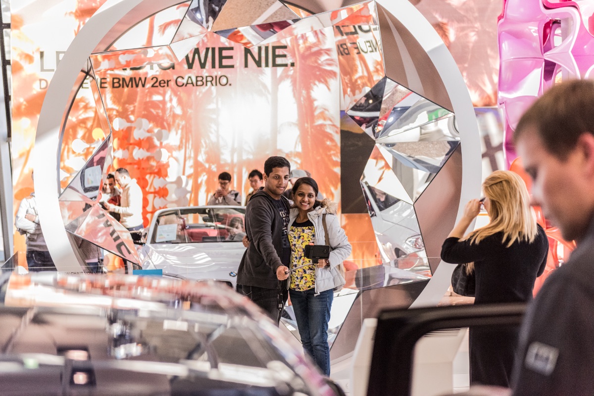
The BMW 2 Series Cabrio exhibition is a clean example. The car was presented inside a rotating mirror kaleidoscope, three and a half metres across. Cognitively, it broke through by sheer size and motion — it stood taller than the cars and the visitors around it, and the rotation registered at the edge of peripheral vision long before anyone consciously looked at it. The intellectual layer worked differently: most visitors, on first sight, could not immediately classify what they were seeing. A rotating object, mirrored, producing fragmented and shifting views, did not fit any familiar category at a trade fair. That ambiguity is what held them. They stayed because the object asked a question — what is this — that the visitor had to resolve by looking longer.
This is the distinction worth holding onto. Relevance is not the same as volume. A larger screen, a louder speaker, or a brighter light source will register cognitively, but if there is nothing to sustain attention once registered, the visitor turns away. Relevance is the combination of breaking through and offering enough substance, ambiguity, or invitation that the visitor chooses to engage further. The work has to be worth looking at, not just hard to ignore.
Immediacy
Can the visitor experience the core message directly, without translation through generic aids?
Immediacy is the criterion most often violated. A team has an idea — say, communicating the experience of rain — and reflexively reaches for a screen showing rain footage. The screen works. It is also a generic, themeless aid that adds nothing of the subject itself. The visitor reads the screen rather than experiencing the rain.
The immediate version of the same idea: project rain onto a translucent gauze stretched through the space. The transparency of the medium and the physical lightness of the fabric carry the atmosphere of a rain shower into the room itself. The visitor stands inside the effect, not in front of a representation of it.
Every time a design proposal contains a screen, a vitrine, a wall label, or any other generic display device, the criterion asks whether something theme-specific could do the same work. Sometimes the generic element is the right answer. Often it is the lazy one.
Efficiency
Does the design achieve its goal without inflated means?
Efficiency is widely misunderstood as a budget argument — finding the cheapest solution. It is not. An efficient design can cost twice as much and still be efficient if it produces four times the result. What efficiency asks is whether every element of the concept earns its place, or whether the concept could be reduced without weakening the core idea.
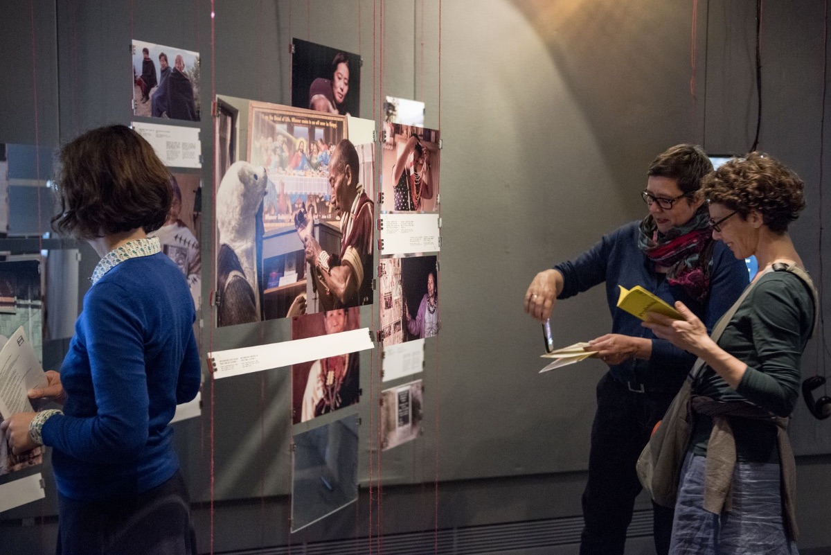
The Paradies der Kopfjäger exhibition at the Humboldt Lab Dahlem was constrained from the start. Small museum projects rarely have large budgets, and the design had to be scalable without losing quality. The initial concept included contemporary objects from present-day Nagaland to demonstrate the continuing relevance of the subject. These were dropped early. In their place, photographs, audio, and video brought back from the curator's research trip were used directly — they were more efficient, more contextually accurate, and they let historical and contemporary material sit in direct relation without the logistical apparatus of object loans.
The efficiency test is structural: which elements of this concept are central, and which are decorative? If something can be removed and the core idea still holds, it should be removed — and the resources reallocated to whatever does the heaviest lifting.
Elegance
Does the design feel inevitable — as if the solution had been there all along, waiting to be found?
Elegance is the hardest criterion to operationalise and the most worth pursuing. The philosopher Hannes Böhringer described an elegant solution as one that "avoids any awkwardness and reaches the goal in a single movement or a few large steps. […] Like the plainness of elegant speech, it surprises through simplicity." From a design perspective, elegance is when the work no longer shows the labour that went into it.
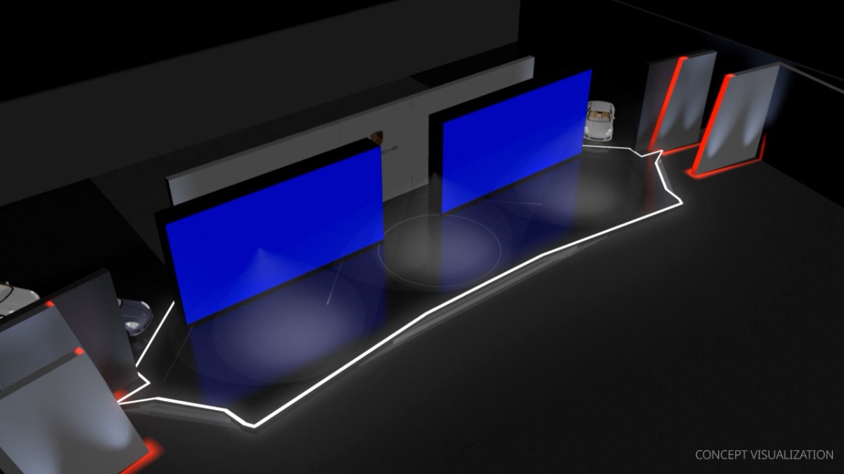
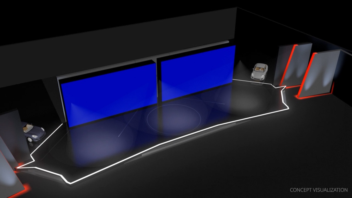
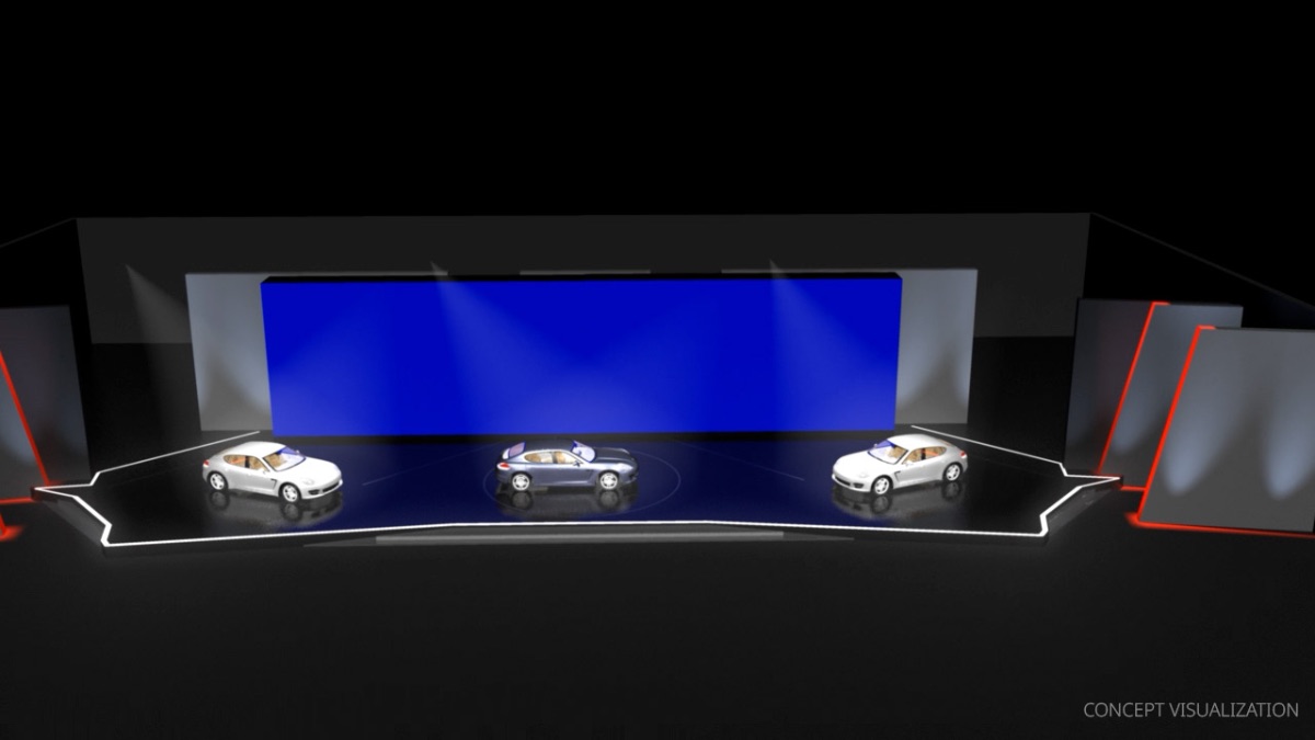
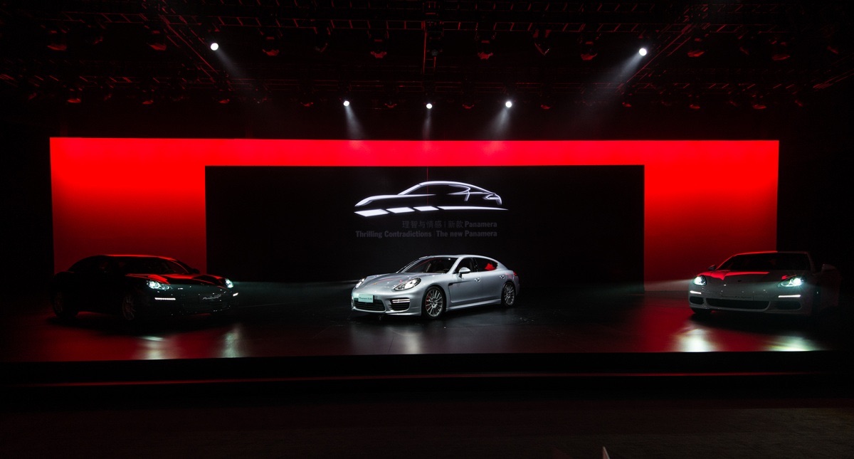
The Porsche Panamera launch is a clear case. The brief's core message was Thrilling Contradictions — comfort and sportiness held together in a single car. Rather than illustrate this with parallel imagery or split staging, the design derived everything from one translational idea: the two contradictions, staged as opposites, would collide and fuse — and the car would emerge from their fusion. Two large LED walls moved across the stage, pulling apart and pushing back together, until they merged in a final moment that revealed the car in the space they had just opened. Space, narrative, light, sound, and image worked together on a single gesture. Once the car was revealed, the LED walls became background, and light took over to hold focus. The whole sequence resolved in essentially one movement.
The marker of elegance is recognisable in practice. There is a moment in a design process — sometimes hours in, sometimes weeks — when the pieces of a concept fit together so cleanly that the result feels obvious in retrospect. Until that moment, the team is still working with parts. After it, the concept holds as a single idea. The Panamera staging had this quality: from the moment it was proposed, neither the client nor anyone on the implementation team questioned the central move. It looked like it had always been the answer.
The test: does the design proceed in clear, simple, logically connected steps from one central translational idea? Does the finished concept feel so self-evident that it appears to have designed itself? If a concept needs three paragraphs of explanation before anyone can grasp it, it is not yet elegant. The work continues.
How the criteria work together
The four criteria are not a checklist run once at the end of a project. They run continuously, in parallel, throughout the design process — and they sometimes pull in different directions.
A highly immediate concept can become inefficient if it requires complex production for a single effect. An efficient concept can lose relevance if it strips away too much to register in its environment. Elegance often requires letting go of features that other criteria would have preserved. The work of design is partly resolving these tensions — finding the version of the concept that scores well across all four, rather than excelling on one and failing on the others.
The criteria also give the team a shared language. When someone says "this concept is interesting but it isn't elegant yet," the rest of the team knows what work remains. When a client asks why we are recommending one of three options, we can answer specifically — this one is more immediate, this one is more efficient, this one is the most elegant of the three, and here is what each trades off.
The full system, with worked examples across every instrument of mediatecture — space, light, sound, image, narrative, interaction — is set out in the Handbuch Mediatektur (transcript, 2018). What this short piece can do is name the four criteria and show them in action. The longer argument is in the book.
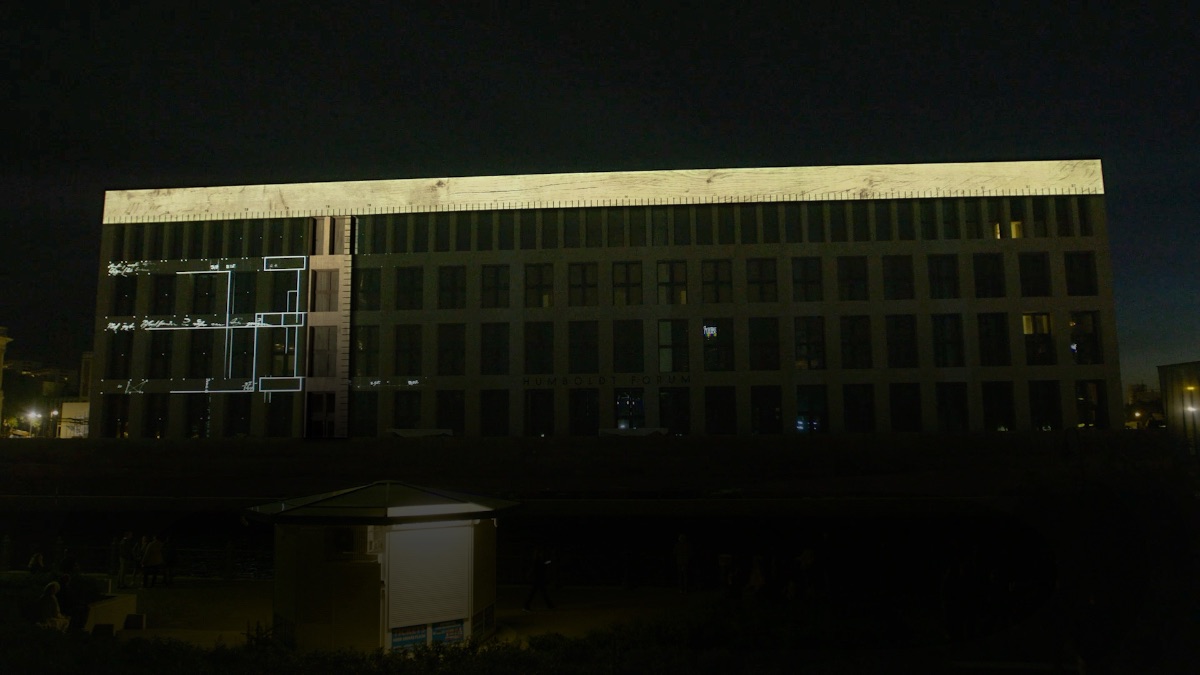
The criteria reappear in every Luxoom project we have published a deep dive on. They are particularly visible in the design of the introductory rooms at the Humboldt Forum, where all four had to be resolved in tight coordination with curators across three institutions. That work is treated separately in its own piece in this section.
Tobias Sievers · 25 November 2025
How We Work