
18 June 2026
Wayfinding under pressure: design for the distracted mind
Wayfinding in high-stakes environments is a cognitive-load problem, not a signage problem — and most systems fail because they assume the user has full attention to give.
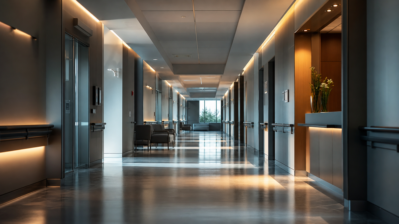
A hospital is one of the hardest places to find your way. Not because the building is more complex than an airport or a transit hub — often it is simpler — but because of who the user is in that moment. Anxious. Late. In pain, or accompanying someone who is. Holding a name, a floor, a department, and not much working memory to spare.
That is the condition the recent Moorfields wayfinding and signage work brings back into view (The Architects' Journal, 15 June 2026). And it is worth being precise about what the problem actually is. A person navigating a hospital corridor is not reading signs the way a designer reads them in a studio. They are scanning, under stress, with partial attention. The environment either absorbs that pressure or adds to it.
This is where most wayfinding goes wrong. It is designed as if the user arrives with full attention available — calm, unhurried, able to parse a hierarchy of information at leisure. They almost never do. So the system that looks considered on a presentation board can still fail at the moment that matters, because looking considered and reducing effort are not the same thing.
We met a version of this constraint directly on The Next Stop, the mobility touchpoint HVV brought to UITP 2025. A traveller at a transit point is also operating under split attention: mid-journey, time-pressured, tracking a departure while a dozen other things compete for the same glance. Over fifty years the bus stop had quietly accumulated layers — real-time displays, accessibility provisions, journey planners, ride-hailing and bike connections — each added separately, none designed to be read together. The result was an environment that asked the user to do the integration work themselves.
The discipline that project forced is the one that transfers. When attention is the scarce resource, every information layer has to earn its place. Not every piece of information is worth showing, and the ones worth showing are not all worth showing at once. The question is never "what could we tell them here" but "what does this person need to decide their next move, and nothing else".
That reframing changes what good looks like. A clean typeface and a consistent colour system are necessary, but they are table stakes. The harder work is sequencing — deciding what a person needs at the door, what they need at the first decision point, what they need only once they are close. Information delivered too early is noise. Information delivered too late is a missed turn. Getting that sequence right is what actually reduces orientation effort, and it rarely shows up in a static rendering.
The useful test is not "is this legible" but "is this legible to someone who is barely looking". A system that passes the first test and fails the second is the one that looks finished and still leaves people lost.
Clarity in these environments is not a stylistic preference. It is a functional requirement, measured in the effort a stranger spends to make their next decision. Design for the distracted mind, and the calm, attentive user is served as a matter of course. Design only for the calm user, and the person who needs the system most is the one it fails.
→ Start a conversation
Start a conversation.
Tell us about the project, even if it's still loose. The first call is about understanding the question — not pitching the answer.
hello@luxoom.com →Luxoom · 18 June 2026
← All writing